Thursday, 2 May 2013

KITTY WITH TITTY FINALS AND CONCLUSION


So I'm done! Finito! I have to say this brief has been one of the most enjoyable briefs this year. Whilst it's nice having restrictions, this was the first time we've been given free reign on content and outcome. Hugo emphasised on experimentation - pushing your own boundaries, and I have. And I know I wouldn't of made a comic or animation this year otherwise. So thank-you! It's been stressful (PRINTING MY COMIC WAS A NIGHTMARE), challenging (all content had to be done by myself) but also very fun, especially bringing Kitty to life. I'm probably secretly known as the girl who draws cats with tits. But the response has been great. My peers seem to love Kitty and there's a chance I *might* put my comic into small production.... this project has opened so many avenues. Most importantly I learnt a lot about animation (I want to pursue it further at some point), Illustrator (too much time on that damn program), printing (bye money) and narratives. Story telling. I'm hopefully better at story telling and hopefully I've fulfilled the brief right by conveying my narrative through 3 different perspectives. It's been a great ride. Hopefully Kitty lives on.
P.S Owner found Kitty. Owner realised his true love for her. And they lived happily ever after.

The End. Yes. I'm poking fun at Disney. 

LOST POSTERS PHOTOGRAPHY

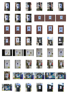
Poster on tree
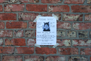
Poster on brick wall
Poster on wood post
Poster on a recycling bin

Poster on bus shelter
Poster on notice board
Poster on brick wall
Poster outside a house (mine.... I mean Owners!)

All the photos from my photo session

So on the streets of Fenham  (I wanted a typical suburban area) I went round posting out my posters. I few awkward stares and an embarrassed face from me. Doing it for KITTY! Owner wants her back. From these selections I'm going to pick the most effective ones and mount them up. 

LOST POSTER FINAL UPDATE

Colour version
B/W photocopy version

So what was wrong with the last one? I didn't think the single 'kitty' for the title worked because it's not a generalisation.... it's her name. So I changed it to "kitty" now which I think makes it grammatically correct. Funny thing was I refused to add them myself because I am obsessed with the fact this poster HAS to be from a male, so no I couldn't just two '  ' myself. I ironically asked another peer called Tom to add them for me. He was very bemused why I couldn't just do it myself too... I'm taking this way too seriously aren't I? Also I would of had to photocopy my posters out again anyway because I accidentally cropped some of the text out when copying. 
So for REALZ. This is THE final version of my lost posters. 

Sunday, 21 April 2013

LOST POSTER FINAL

First initial draft
Draft of final
Any 'designer' should know by now that you ALWAYS have a spare. Or you should do a test on the final final thing... this case the paper. I gave Tom quite a few specifications. Such as trying making the  "have you seen this cat with tits" in a bigger font size, making things more centre aligned etc. small bits. With this draft I wasn't quite happy Kitty's tits touched the darker fur, too many varying text sizes and I noticed he tends to write out the uppercase 'U' as lower case. But it's ok... this is the final draft and that's the quirk of his handwriting. As you might of noticed we added owner to the last line too. 
Well I thought this was the final till I realised Tom didn't do the 'tit' crossed out and replaced with 'it' joke. My fault for not double checking. "TOOOOOOOM."
FINAL! Happy with the proportion of everything and I got him the fill in the arrow. Now to post these round Newcastle!

LET'S FIND KITTY! 

POSTER FINAL DRAFT

I know.... how many times have I been testing out this supposedly emergency lost poster. Hey what can I say. Designer me says "TOO MANY FUCKING FAULTS."

So I decided to go with Tom to be Owner. I got him to write out one of the lost posters I had done previously and he's done a great job except the boobs.... Tom's been a bit modest - they are a bit uneven too. Anyway I'm going to make him write the text generally a tad bigger, tits bigger and add 'owner' into the contact number part since this is owner's interpretation of the story. I've printed  the 'blank' poster out at the printers (160 gsm.. since I'm going to mount the original). The 'original' is obviously going to be in colour but the ones I put around Newcastle (and photographing) will be in B/W since I am photocopying them.  Going to get Tom to write it out this weekend and I should be photocopying and photographing my lost poster series this week... GO GO GO. This is the last one!

KITTY WITH TITTY ANIMATIC...... FINISHED.


I preferred Chris' version anyway but I got my flat mates some who do and don't do anything design related (3D design, medic and modern language something) for their opinion on which one they preferred. Tom summed it up with this: "I like Chris', it has a bit of french art house vibe going with it when combined with the vid. The Broke For Free sounds good with the beat and how it develops further and has lots of little highlight, but I think it gets a bit complicated further into the vid, whereas the simplicity of Chris' is a strength in not distracting from the video itself." Anyway I personally like the mood Chris' version evokes - to me it actually seems happy but 'creepy' vibe... and just generally flows because it's been personally composed to my film. It's uploaded on Vimeo so the quality I'm sure is 1000x better thanYouTubes (but please still watch in HD). THE FILM IS COMPLETO. 

COMPARE THE TWO

Original test animatic
Final animatic
DIFFERENCES:
  • CUT OUT OPENING CHANGING HEARTS SEQUENCE
  • ZOOM IN OF KITTY SEQUENCE
  • KITTY DOESN'T SPELL OUT LOVE
  • G.F'S HEAD COMING UP IS REPLACED BY HAND
  • KITTY ISN''T SHOWN IN THE BACKGROUND INSTEAD THERE'S A SCENE WHERE SHE HAS BINOCULARS
  • CHANGE OF KITTY AND BOOBS DILEMMA SEQUENCE
  • ALTERNATE VERSION OF KNIFE SEQUENCE
  • KITTY ISN'T SHOWN WAITING FOR OWNER AT THE END
  • OWNERS JUMPS AND FALLS AT THE END
  • CUT OUT 'WTF' END AND IS REPLACED WITH END CREDITS
I briefly mentioned some changes I had to make on the spot when I was filming and the above is what got cut/changed.. just didn't make the final cut. I intended and had everything so that I followed my test animatic but I either was running out of time or I was having troubles with the camera focusing... mainly the latter. Simon helped me set it up so that it only focused at a specific height/'light spot'. So if I played around with certain camera shots (extreme zoom in or out) the camera just wouldn't focus. So I just had to roll with it and think on my feet. The narrative is exactly the same - just some changes in how it is conveyed. Somethings such as the binocular scene I did pre plan when I was collaging my pieces because I knew proportionality I couldn't fit everyone in. 
Hopefully the final animatic is better than the test. 

Wednesday, 17 April 2013

BETWEEN THE TWO

Chris Bygrave
Broke For Free

Which works better? I should add the videos will be slightly different to each other as I've had to edit each  film specifically so that they sync with the music  at the right moments. 

CHRIS MAKING MUSIC FOR KITTY

I was there for moral support. In the swanky Newcastle university music studios. Chris sorting out the recording programme and me taking photos for this blog. 
Chris playing his piece. He must of done it at least 7 times.
Watching the music with my animation to check it 'works'
Chris' work!
His composition 
His composition synced with my animation. 

Ahhh so 'we' did it! Chris Bygrave managed to work out how to record the sound yesterday and we spent roughly an hour? in the recording studio. Chris composed this piece especially for my animation and I'm so happy. It flows with my narrative really well and I feel it is a lot more personal having someone specifically on board with your project. I can't thank him enough for taking his time out to compose and record this for me, as he's got his hands full anyway with nearly finishing third year. THANK-YOU Chris. Again. I still owe you a copy of my comic and coffee sometime.
I'm going ask some peers for their opinion with this soundtrack and my other alternative which I decided on just because it's way too risky to just rely on someone to help 'finish' your piece.
I think both have different qualities but I feel so 'attached' to my project I think my judgement might be clouded and I need some pure unbiased opinions. It is up to me but sometimes it's about the audiences feelings too since they will be the ones deciphering it. 

Monday, 8 April 2013

KITTY WITH TITTY- THE GIRLFRIEND EDITION...... THE FINAL VERSION


My friend/classmate told me about Issuu today so here's an on line version of my comic. This is the final FINAL version. I've found so many little 'things' with my other versions. Small, probably unnoticeable to others, but bugged the hell out of me. So after many Illustrator revisions.... here it is! Enjoy!

Thursday, 4 April 2013

POSTER DEVELOPMENT

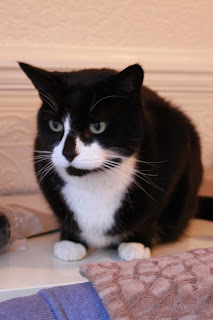
My shortlist of Kitty photos - decided to go with the first since it's the one looking most direct and connotes "find me please" eyes (if that exists). Actually looking at these photos Stitch is an epic cat model - he's so professional  Never looking quite directly at the camera... he was so posing for me. Fuck, why am I analysing a psyche of a cat. 

So today was 'C' day to decide on my poster layout/image/content. I think I will still get a male (either Tom or Nathan from my earlier tests) to do the writing because it makes sense if it's from Owner who's erm a male for it to be written out by one too. And I think for me personally I lose the detachment of making things 'perfect' because it is suppose to be hastily written. I've played around with either the content or layout with each one. Tweaking things around but essentially it tells the story of Kitty within an A4.  I think from reviewing it aesthetically and content wise I'm currently inclined to go with poster: 1 or 6. I think they look most 'real' and combines the right balance of content. I'll get my flatmate/friend's to do a rough copy each and then to the real deal and posting them around Newcastle!

Wednesday, 3 April 2013

WE'VE FOUND KITTY

STITCH YOU HAVE BEEN CAST AS KITTY! Look forward to seeing lost posters of you dotted around Newcastle with tits scrawled on! 
Here's all the photos from the  photo-shoot I had at Leanne's. Think there's 127 photos of epic cat-ness. 

I've chosen Stitch to be Kitty! Here are the best shots of him (yes he's a male) that I can easily draw tits on for my lost poster. I'll print them all out and decide which one suits the most when I do some cropping/in context and all that jazz. 

KITTY WITH TITTY - MUSIC

Here's my film synced up with music (As always please watch in HD) - Broke For Free - Night Owl
I found this song from YouTube and Free Music Archive  which is a site that allows you to legally download audio by a range of artists in every genre imaginable. When I heard Night Owl I just knew it could possibly work with my film - there's an upbeat quality and the beat I think works in synergy with the stop motion timing/rhythm. I'll keep my ears open to any more music I think 'works' too but for the meantime this and Chris' is my main focus.
Here's the initial rough idea my friend Chris Bygrave thought of for my film. He's a third year music student at Newcastle University and we met at a house party and whilst doing some talking he's somehow involved with my project. Which is really nice of him. I've not synced his music with my film because it wouldn't give his work any justice because the quality is so poor (since it's just an initial rough). We are meeting up this week to record it properly in a studio. I really like his interpretation - it creates a different mood for my film and I guess it flows better since it's been custom made to my narrative. I gave Chris free run and trust his judgement and knowledge in music production. I might make a few suggestions here and there but for the most part I think our collaboration is to respect each others fields? I feel since I'm asking such a  huge favor I don't feel comfortable having a dictatorial role. He says I can, but I trust him to do a good job. I'm looking forward to meeting up and recording the audio - how cool a guy you met at a party, happens to do music and is now helping you on your film.... thanks Chris. 

EDITING FINAL FILM

SECOND EDIT
FIRST EDIT

THINGS I STILL NEED TO AMEND AFTER REVIEWING LATEST EDIT:
  • too slow in parts
  • love scene make quicker
  • boob grab
  • knife montage
  • end feet scene
  • credits faster
These are the first two initial edits of the film - a tedious process but I'm getting there. It's good to just review them after you've had a break from it because you get to put your 'viewer' perspective on and see flaws from their point of view. I try to anyway. I mainly just need to speed up parts and the music is coming together - my friend has sent me a rough edit and we'll be working on it together this week. I also found another song that could work but again it's a working process - whatever suits the film is the direction I'll go down. I'll update with music next! Back to editing!

Friday, 29 March 2013

DAY BEFORE FILMING


I have the most amazing house mates ever. The day before filming I couldn't find a suitable male hand for my animation. My morning conversation with Allan just consisted of: "Allan, I need to take some photos of your hand pretending to be grabbing a pair of boobs." This is becoming normal where I ask them to do the most random-est things ever for my uni work.

KITTY AUDITIONS - LILO VS. STITCH

 Stitch
Lilo

I should also add both of them are actually boys but shhhhh. And the style of photography is meant to be 'authentic' - I don't know... like typical cat lover taking pictures round the house of their pet.  Nothing too perfect so the background etc adds the the 'realness'.

I basically held an X Factor audition for cats to find a suitable cat-or or cat-ress to play Kitty. Or also known as desperately trying to find someone with cats! Thankfully Facebook came in handy and my course mate offered to help me. Her sister who is a cat lover very kindly offered to pop round hers and snap away. My welcome gesture was a tin of cat food (Waitrose - lucky cat). So it's between Lilo (black) and Stitch (ginger) to battle it out. I don't think it really matters who I choose because Kitty's been reincarnated into so so many different styles - don't think a specific breed comes to mind. I know her body in my animation is a domestic style cat which in this case Stitch would be more suitable. Anyway here are a couple of snaps of Lilo and Stitch I took because not all students nab stuff of the internet. Yes I moved away from the computer.