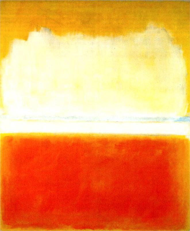
MARK ROTHKO, NO.8 (1952)
Thomas mentioned he didn't want just a single block colour for every scene - so maybe a bit like Rothko's piece where it's been broken into parts with different sections.
Thomas mentioned he didn't want just a single block colour for every scene - so maybe a bit like Rothko's piece where it's been broken into parts with different sections.
WASSILY KANDINSKY
Whilst talking about the relationship between colour we touched upon Kandinsky and synaethesia - the capability to see sound and hear colour. The mixing up of senses. His works are again all in colour so perhaps visually our assignment should reminisce to this?
SOURCE
From 0:28 - 0:58
I decided to base my work on one of my favourite films - Spirited Away. I only saw this about 2 years ago because I was a bit douche-y and didn't get the hype around it.... so wrong. Miyazaki is AWESOME. The narrative/characters/music everything is so epic. I initially wanted to do the trailer but I felt it was too fast for me to concentrate on specific parts. So the scene I've chosen is one of the more tense and memorable parts of the film - which is ideal to convey using colours I think.
The pig scene reminds me of when Pinocchio's friend turns into a donkey - opps tangent.

2)brights
3)dark hues
4) more brights
Version 1
Version 2 - added more scenes
The final outcome
Week 2's assignment - choose a short clip (max 30 seconds) and rework this clip only in colour. Original sound allowed.
This exercise was fun and challenging, figuring out colour combinations using the theories we covered (metaphors/contrast) and just the task of trying to visually represent the scene/emotion/mood in 30 seconds with the audio. I'm quite happy with mine because initially they were mostly block colours and some of the sequences I created looked out of sync but I spent a lot of time thinking of ways to convey parts of suspense/crashing/running through the colour use and shapes such as the running scene (the single square to mimic running), shouting (having the squares increase), the whipping (flashes of yellow to connotate speed), the "urgh" with the green (sick), excitement (alternative flashing boxes), the calling of "mom" (pink) and "dad" (blue)... stereotypical but works! And a bunch of other stuff like that. I think these techniques used flows well with the audio so I think fulfills the task of illustrating a moving visual only with colours.
SOURCE
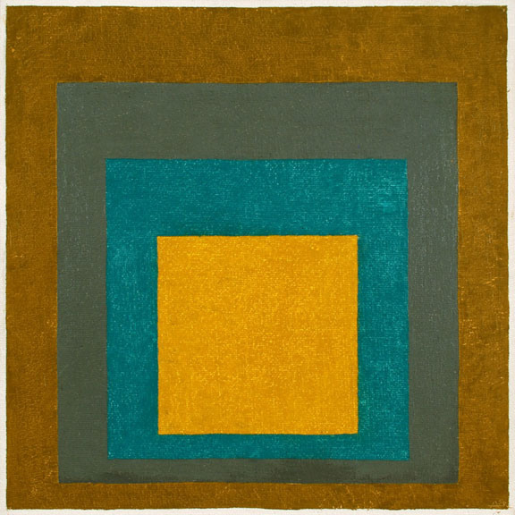
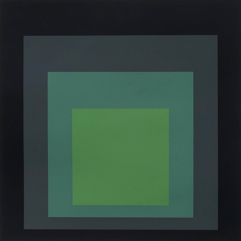
JOSEF ALBERS
Technician mentioned him when I talked about this task and it's awesome. Block colours and experimental pairing of colour ways.
I decided to base my work on one of my favourite films - Spirited Away. I only saw this about 2 years ago because I was a bit douche-y and didn't get the hype around it.... so wrong. Miyazaki is AWESOME. The narrative/characters/music everything is so epic. I initially wanted to do the trailer but I felt it was too fast for me to concentrate on specific parts. So the scene I've chosen is one of the more tense and memorable parts of the film - which is ideal to convey using colours I think.
The pig scene reminds me of when Pinocchio's friend turns into a donkey - opps tangent.
Once I selected the clip I was using I broke it down into sections (storyboard I guess) of the important scences I should visualise. So the 30 seconds is now 26 scenes for me to turn into colour!
Rough sketches of the scenes with colour - I ended up cutting out 3 scenes out because they were unnecessary.
I decided for good reference (placement) to screen shot all the screen grabs I'm going to use for the colour clip.

I had a feeling this wasn't quite the idea, but I thought it's still colour blocks? It looks a bit 8-bit, far too 'detailed'. Anyway my friend explained her interpretation of what the assignment meant so I might use a few of them but then do the 'right' thing of capturing the story/emotions through the block colours. At least I found out sooner than later..... back to the drawing board!
Just found these videos which is what I think they want. Thomas did say to be more experimental so I might play with the concepts of the above.
1) my initial thoughts on colours
Some sketches/storyboard/ideas/techniques on how to visualise the scenes with blocks of colours.
2)brights
3)dark hues
4) more brights
Version 1
Version 2 - added more scenes
Version 3 - colour change, colours didn't reflect the mood which is much darker
Version 4 - changed the ending scene
FINAL! 57 scenes in total but for my final video I ended up with75 - I repeated a few of the scenes and also cut out parts that didn't quite fit when paired with the audio.Week 2's assignment - choose a short clip (max 30 seconds) and rework this clip only in colour. Original sound allowed.
This exercise was fun and challenging, figuring out colour combinations using the theories we covered (metaphors/contrast) and just the task of trying to visually represent the scene/emotion/mood in 30 seconds with the audio. I'm quite happy with mine because initially they were mostly block colours and some of the sequences I created looked out of sync but I spent a lot of time thinking of ways to convey parts of suspense/crashing/running through the colour use and shapes such as the running scene (the single square to mimic running), shouting (having the squares increase), the whipping (flashes of yellow to connotate speed), the "urgh" with the green (sick), excitement (alternative flashing boxes), the calling of "mom" (pink) and "dad" (blue)... stereotypical but works! And a bunch of other stuff like that. I think these techniques used flows well with the audio so I think fulfills the task of illustrating a moving visual only with colours.


