
SOURCE
I'm guessing this is another joke poster but I like the different use of photos and the bullet point style to break down the information. Again hand written out that adds to the authenticity - in a rush to get this poster out. I'll have to experiment with my own handwritten or even get over people because I think my handwritten is too stylised - maybe even a bit feminine. And this is suppose to be written by Owner.
I'm guessing this is another joke poster but I like the different use of photos and the bullet point style to break down the information. Again hand written out that adds to the authenticity - in a rush to get this poster out. I'll have to experiment with my own handwritten or even get over people because I think my handwritten is too stylised - maybe even a bit feminine. And this is suppose to be written by Owner.

SOURCE
Missing poster that utilises colour - play around with colour theory? Red?
Missing poster that utilises colour - play around with colour theory? Red?

SOURCE
This definitely has the 'rough' quality I'm looking for - though it does border on a child's done it..... but hey it's not about having a piece of art. We need to find Kitty!!!
This definitely has the 'rough' quality I'm looking for - though it does border on a child's done it..... but hey it's not about having a piece of art. We need to find Kitty!!!
SOURCE
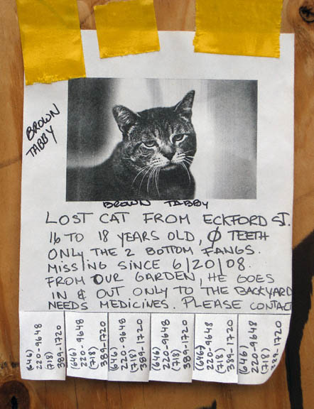
Cramming of all the text, slight typo correction, various tape adhesives and grainy photo. There's also the pull out contact tabs at the bottom which could be a nice feature.
Cramming of all the text, slight typo correction, various tape adhesives and grainy photo. There's also the pull out contact tabs at the bottom which could be a nice feature.
SOURCE
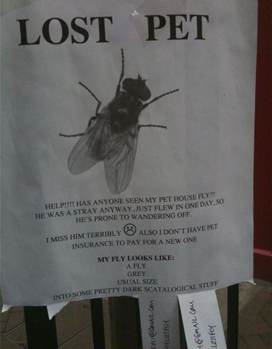
Massive kerning, use of emoticons and also witty/funny which is my aim for my poster - serious but funny edge. We are talking about a cat with tits here.
Massive kerning, use of emoticons and also witty/funny which is my aim for my poster - serious but funny edge. We are talking about a cat with tits here.
SOURCE
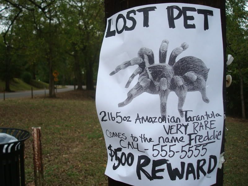
Large image and the harsh marker pen writing. The title and reward have a more 'scratchy' look to add emphasis.
Large image and the harsh marker pen writing. The title and reward have a more 'scratchy' look to add emphasis.
These posters are more in line of the approach I'm hoping to achieve with my poster. There needs to be a deliberate 'bad' quality if I want it authentic. If owner was quickly doing a poster I don't think he'd care about using Helvetica and taking his time kerning. I'm thinking best route is for it to be in black and white and I'm deliberating between handwritten or using digital type. And using a drawn image or photo - though I'm currently learning a more photographic version of Kitty since my interpretations of her so far have been very stylised. I think I'll do a couple of versions of these posters and see what looks most authentic as I do want them to be realistic and be put them in public domain.
No comments:
Post a Comment